Work Completed Since 6 January
All pre-production, including shot list, script, storyboard, mise-en-scene, and project schedule is complete.
Any incomplete pre-production tasks
No. There is no incomplete pre-production tasks. However, there are some improvements I would like to make on my shot list which Mr Halsley suggested to me.
Next Steps/Action Plan
The next steps are to start prioritizing what scenes will start to film and when. After this, we will then need to start filming, and next week we will need to do the photoshoot, and start designing the A5 brochure.
Date filming will be complete
All filming will be complete by the 31st of January
Requirements for photo-shoot next week
We will need to film after school or on set, due to the fact that our cast are not media students and some do not study here. We simply need the cast to wear the clothes they will be wearing during the filming.
Thursday, 21 January 2016
Tuesday, 19 January 2016
Photoshoot
1. Which of your main characters will appear on the front cover of your programme?
Sidra, the unstable main character of the film, and Myla, her imaginary friend who is a figment of her schizophrenia, will appear on the front cover of the programme.
2. What image or images do you need for the contents page?
The images required for the contents page will be Sidra and Myla dressed in their casual clothing. But, at the same time, will use images from the other films in class, to make it look professional since if it was a real programme, it would feature all of them.
3. What images or images will you use for the double-page spread?
I will only feature images of Sidra and Myla
4.
Close up of Sidra
Medium shot of Sidra in front, with Myla behind her.
Extreme close-up of Sidra's eyes.
Medium shot of them both side by side
5. What costume, props or make-up will you require for the photoshoot?
The costume will be a simple casual urban outfit. The one they both wore during filming. We will not feature any props. But, for make-up, they will do the same makeup they did for the filming which is simple and natural.
6. How will you make sure you have everything prepared for the photo shoot on Wednesday 20 January?
We will not be doing it on that day, but the next week on the Thursday. We will make sure we have everything prepared for then by gathering the actors around, and going through everything they need as they are wearing their own clothes and doing their own makeup.
Research
Research
1.

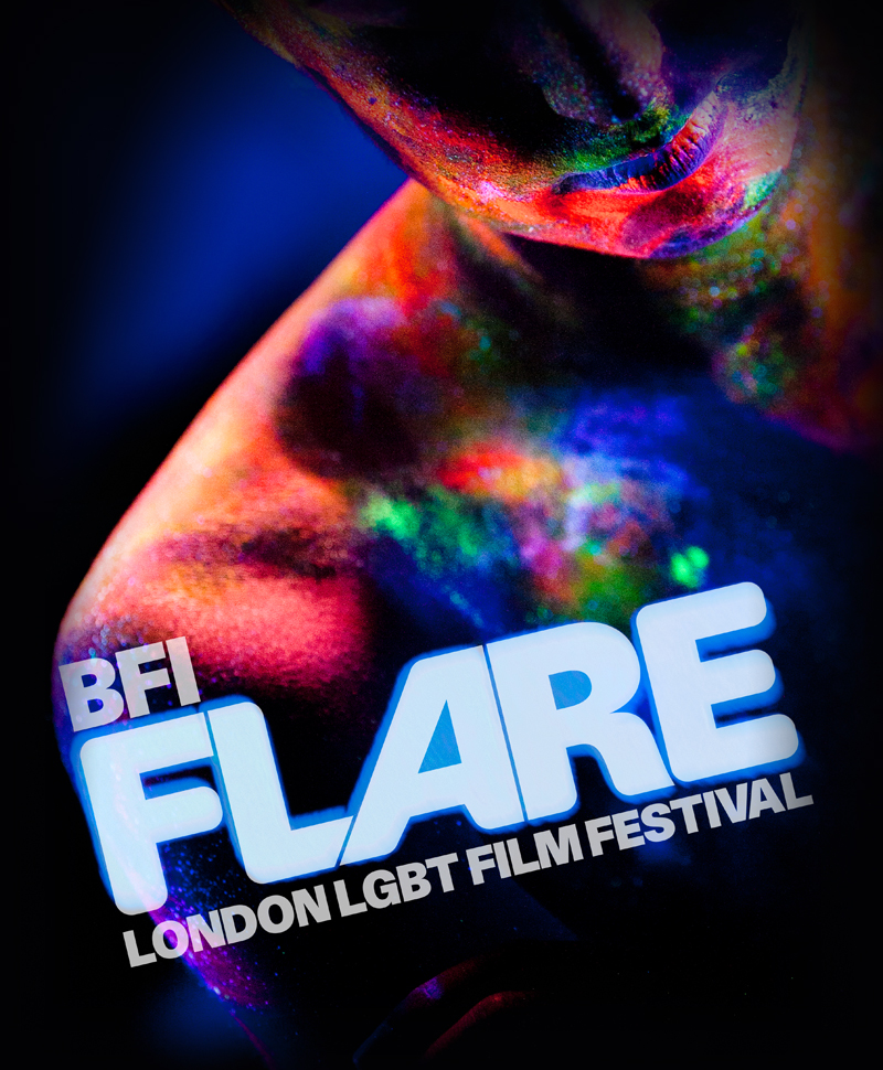
I find that it is a very visually appealing piece due to its simplicity, through a lack of colour scheme, font and lack of graphics around the text, which is extremely effective for an arthouse cinema or festival programme. However, its simplicity also diverts from the typical conventions of a magazine cover, due to the fact that the typical front cover of a magazine usually has a lot of graphics and a variety of texts and is covered top to bottom, unlike this programme cover. The BFI logo is centred directly in the centre of the page, with the central image located inside the text - an extremely creative way of captivating the text's audience. On top of these, it features the company it is sponsored by in small writing, the dates of the festival underneath the festival logo and BFI print logo in the top left-hand corner.
2.
What I like about this programme cover is the neon colour scheme, which contrasts to the simplistic colour scheme, of very few colours, on the usual BFI programmes. It goes to show that either a variety of colours and lack of colours is workable, giving the programme I'm making a broad range to work from. I love the graphics used, because the neon colours have been illuminated using black lights/ultra violet lights, which is extremely appealing, working with the text and colour scheme to make an extremely appealing piece.
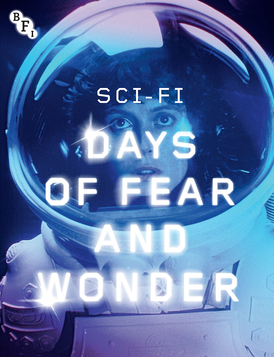
The text for me is one of the most appealing parts of the programme, due to it's glowing special effect and the brightness of it. It really stands out, but also links to the genre of Sci-fi. This indicates I will need to have something linking to the genre of my film on the programme cover. But the central image is also one of the key features and most appealing parts of the programme as well, with it's filter and colour scheme, giving it a daydream esence.
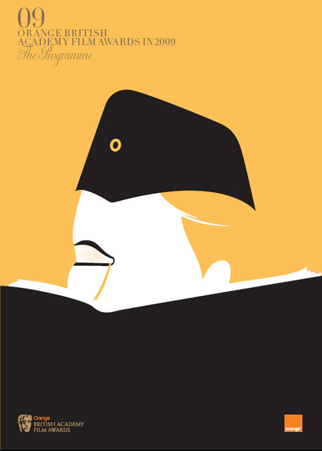
For me, the simplistic colour scheme and cartoon-esque central imagic makes the programme seem classic and vintage. Taking a lot at some of the other programmes from the same year and same award event, they all feature the same elements, resembling the different films. This cover was linked to the film the reader,

The colour scheme of the brochure is particularly bright and vivid, with a variety of shapes and colours against a black background. The central image is a collage of shapes which make up hands over eyes, looking at something through binoculars, which is extremely creative.

The colour scheme and design of these two programme covers happen to be my favourite. The bright, slightly garish colours are extremely nice against the central image. I love the clever central images of each of these, the second one in particular as the items make up the face of a character. It would be a great idea to do.
3.

The title of the contents page is the most intriguing feature, as the red text is placed directly behind the central image, which works extremely well due to the brightness of the text and the white lining inside it. If it had been any other colour, it wouldn't have worked as well. The colour scheme is simple but effective with the red, white and black text and background working well together.
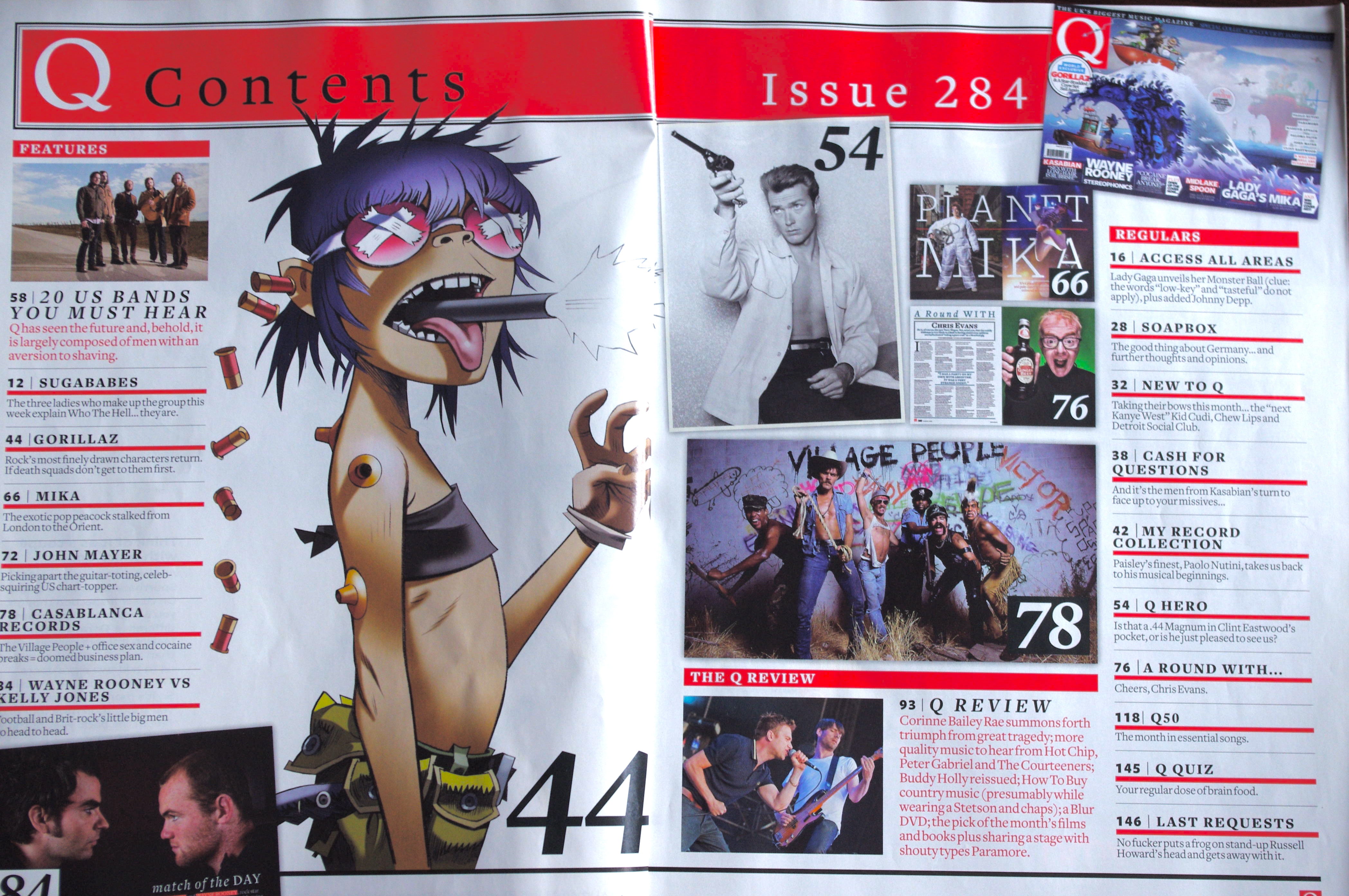
Like the previous one, the colour scheme of the contents page is simple yet effective, with the black of the title, working well with the red. There isn't really a central image, but the most prominent and most notable one is the Gorilla's cartoon which takes up more space than the other images. However, all the other images included work well to give a short overview of what the magazine will be like well.

The light colour scheme of the pages is light and quite calming, but also easy to read. The central images clash with each other slightly, but it works well.

The colour scheme is a mixture of dark and ligth, which blends well together. The images have been kept to the left while the text appears on the right.

Like the many other contents pages I've viewed, a key colour in it is red and black, which is simplistic yet bold, making it easier to read. The main image appears to be of the main story which is batman, and various other images from stories surrounding it, with their numbers labelled to indicate the order in which they are.
1.
I find that it is a very visually appealing piece due to its simplicity, through a lack of colour scheme, font and lack of graphics around the text, which is extremely effective for an arthouse cinema or festival programme. However, its simplicity also diverts from the typical conventions of a magazine cover, due to the fact that the typical front cover of a magazine usually has a lot of graphics and a variety of texts and is covered top to bottom, unlike this programme cover. The BFI logo is centred directly in the centre of the page, with the central image located inside the text - an extremely creative way of captivating the text's audience. On top of these, it features the company it is sponsored by in small writing, the dates of the festival underneath the festival logo and BFI print logo in the top left-hand corner.
2.
What I like about this programme cover is the neon colour scheme, which contrasts to the simplistic colour scheme, of very few colours, on the usual BFI programmes. It goes to show that either a variety of colours and lack of colours is workable, giving the programme I'm making a broad range to work from. I love the graphics used, because the neon colours have been illuminated using black lights/ultra violet lights, which is extremely appealing, working with the text and colour scheme to make an extremely appealing piece.
The text for me is one of the most appealing parts of the programme, due to it's glowing special effect and the brightness of it. It really stands out, but also links to the genre of Sci-fi. This indicates I will need to have something linking to the genre of my film on the programme cover. But the central image is also one of the key features and most appealing parts of the programme as well, with it's filter and colour scheme, giving it a daydream esence.
For me, the simplistic colour scheme and cartoon-esque central imagic makes the programme seem classic and vintage. Taking a lot at some of the other programmes from the same year and same award event, they all feature the same elements, resembling the different films. This cover was linked to the film the reader,
The colour scheme of the brochure is particularly bright and vivid, with a variety of shapes and colours against a black background. The central image is a collage of shapes which make up hands over eyes, looking at something through binoculars, which is extremely creative.
The colour scheme and design of these two programme covers happen to be my favourite. The bright, slightly garish colours are extremely nice against the central image. I love the clever central images of each of these, the second one in particular as the items make up the face of a character. It would be a great idea to do.
3.
The title of the contents page is the most intriguing feature, as the red text is placed directly behind the central image, which works extremely well due to the brightness of the text and the white lining inside it. If it had been any other colour, it wouldn't have worked as well. The colour scheme is simple but effective with the red, white and black text and background working well together.
Like the previous one, the colour scheme of the contents page is simple yet effective, with the black of the title, working well with the red. There isn't really a central image, but the most prominent and most notable one is the Gorilla's cartoon which takes up more space than the other images. However, all the other images included work well to give a short overview of what the magazine will be like well.
The light colour scheme of the pages is light and quite calming, but also easy to read. The central images clash with each other slightly, but it works well.
The colour scheme is a mixture of dark and ligth, which blends well together. The images have been kept to the left while the text appears on the right.
Like the many other contents pages I've viewed, a key colour in it is red and black, which is simplistic yet bold, making it easier to read. The main image appears to be of the main story which is batman, and various other images from stories surrounding it, with their numbers labelled to indicate the order in which they are.
Subscribe to:
Posts (Atom)